Our free Monthly Newsletter for School Timetablers: Click here for more info, or to sign-up.
© 1979-2025 October Resolutions Ltd
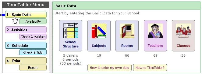
This shows the Main Menu, and Step 1 : the Basic Data screen, with five big buttons.
Each button leads you to an entry screen.
To enter your data you would start at the left, and work your way across to the right.
Look how straightforward it is, compared to other programs !
And the fully-illustrated printed Manual explains each step, in detail.
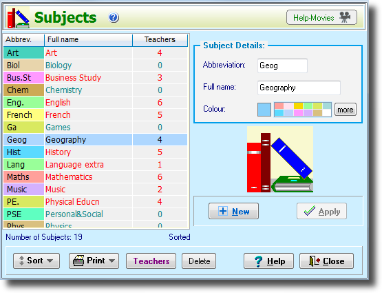
This is the screen for saying which Subjects you will want to timetable.
You can return here at any time to edit / alter your data.
You can give each Subject a colour – this helps during scheduling, and for the printouts.
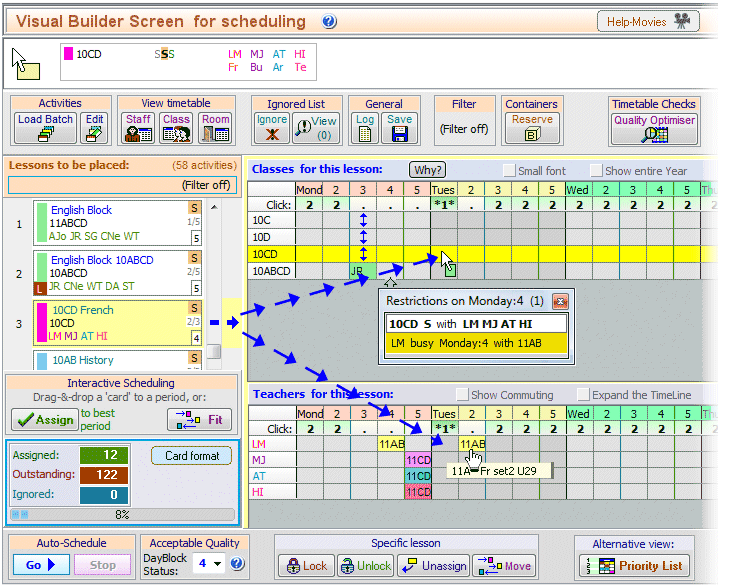
This is the main screen on which you do the actual scheduling.
You can sit at this Visual Builder Screen and drag-and-drop to ‘drive’ through the timetable.
At first sight it looks very complicated. To see what each part will do for you, please click on: www.timetabler.com/kb/UsingtheVisualBuilderScreen.pdf

This shows you the Class Timetables, so you can see the pattern while you are scheduling lessons.
There are similar screens for the Staff Timetables and for the Room Timetables.
If you use dual monitors you can see these more easily and spread them out over the bigger area.
All the buttons, and the symbols, are explained when you click on the  button.
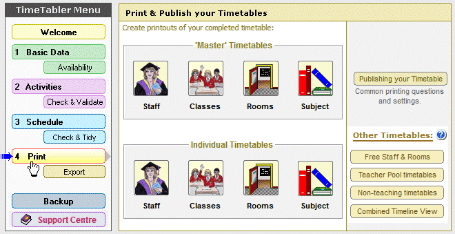
This shows you some of the possibilities for the Printouts.
Within each of these, there are millions of ways of fine-tuning the exact design of the Printouts.
They can be printed on paper, or produced as web-pages, at the click of a button.
A professional result.
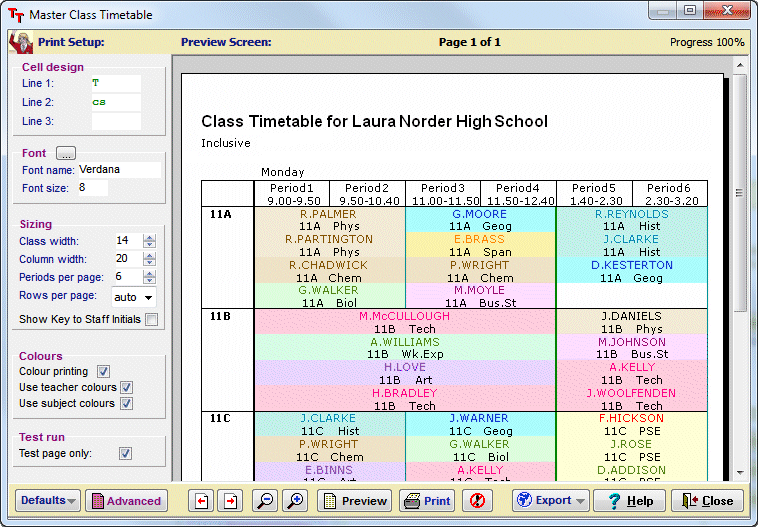
This shows you the Preview Screen , so you can design the ‘master’ Class printout, before printing it.
There are similar screens for the Staff Timetables and for the Room Timetables.
You have total control over the design, the font and the colour, the column widths, the labels, etc, etc.
All the buttons and the controls, are explained when you click on the  button.
